Source for Inspiration, Insight, & Ideas
Our Office
-
#835, 2nd Floor, 4th Main Road,
-
Vijayanagar, Bangalore 560040
Source for Inspiration, Insight, & Ideas
CREATIVE DESIGN / White Space
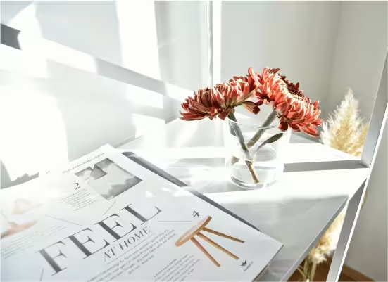
In design terms, white space, also known as negative space, plays a crucial role by preventing the core message from being flooded by visuals and content. We rather avoid filling every inch of a page / screen with colors, graphics, or fonts, instead use white space to create a clean and organized layouts.
Not only that, by limiting the use of multiple colors, elements, and fonts, we ensure that the audience’s attention is drawn directly to what matters most. This aids in readability and understanding yet making it look aesthetically pleasing. For instance, a simple poster with a bold headline and sufficient white space will draw more attention than a crowded one. White space in any design gives the content room to breathe, making it well-balanced.
Apple’s website for example is widely recognized for its right use of white space, which helps users focus on the product and key messages without distraction. Similarly, high-end magazines often use ample margins and spacing to create a sense of elegance and sophistication.
Enhances Readability: Content is easily understood when surrounded by white space, as the idea / thought is conveyed to the audience in one go.
Creates Elegance: Designs with ample white space often feels more professional and sophisticated and the detailing put to the design grabs the attention.
Reduces Cognitive Load: In this fast-paced world with lesser attention span, minimum & appropriate content helps viewers absorb the message faster, hence the information is conveyed to more viewers. It’s an advantage for the brand to stand-out from the competition.
Improves User Experience: Users find it easier to navigate and interact with uncluttered designs and retain the audience as they have a better overall experience with that piece of information.

Perceived as Wasted Space: Some view white space as an inefficient use of the area, especially in print or digital ads. Achieving the right balance of white space is a skill; too much also can make a design feel empty, while too little can cause clutter.
Not Always Appropriate: In certain contexts, such as technical diagrams or dense reports, excessive white space may reduce clarity or completeness. Here we need to think of ways to present the provided information though to make it effective.
White space is a skill that helps prevent the message from getting lost amid visual chaos. It eliminates the need for numerous colors, elements, or fonts, resulting in elegant, simple, and beautiful layouts that easily capture attention. While it offers many benefits, including improved readability, user experience and retaining them, we must also be mindful of its drawbacks. When used thoughtfully, white space can elevate any creative project, making the message clear, sophisticated, and making an impact in the viewer’s mind.
CREATIVE DESIGN / Design Consistency
Design consistency, what we call it as the bridge between a cluttered marketplace and a memorable brand in this fast-paced digital and physical world of marketing. Maintaining a unified visual language across every touchpoint—from social media to physical packaging—businesses transitioning from being just another option to becoming a trusted & a noted brand.
To achieve a "design consistency, several key elements must be meticulously aligned. When these are executed, they form a cohesive brand identity that resonates with their audience:
Colors: Using color codes (HEX, RGB, or Pantone) as per the brand, looks uniform on a smartphone screen as it does on a printed billboard.
Typography: Maintaining consistency while using typography and typefaces and hierarchies (e.g., using specific fonts for headings vs. body text) will guide the audience's eye for a predictable reading experience.
Spacing & Grid Systems: Margins and padding create a sense of order. When layouts follow consistent grid patterns, users navigate intuitively without having to "relearn" how to use your piece of communication.
Positioning: Maintaining the placement of key elements—like the logo, navigation menu, or call-to-action (CTA)—in the same relative positions across creatives irrespective of the platforms reinforces familiarity.
1 Brand Recognition: This is the immediate byproduct of consistency. When a viewer repeatedly sees the same color palette, unique typography, and layout, they visually "embed" in their memory. Think of an Apple's minimalist white space or Netflix's signature red; they are recognizable even without a logo.
2 Talk of the Town: A professional, cohesive look signals quality. High-quality, consistent designs are more "shareable" and emotive. Often results in organic conversations and word-of-mouth recommendations.
3 Brand Value: Consistency builds trust and reliability. If a brand looks "uniform" across every piece of creative, reflects as a professional and well-defined brand in the minds of the customer. This builds "brand equity," making the business more valuable in the eyes of investors and consumers alike.
4 More Business: Familiarity breeds confidence. Customers more likely to choose a brand which is consistent over an inconsistent competitor. Clear, consistent design also reduces "cognitive load," making it easier to complete a purchase.
5 Brand Revenue: Eventually, the combination of trust, recognition, and ease of use leads to higher conversion rates and customer loyalty. A consistent brand maximizes the impact of every marketing cost spent.
The Inconsistency Trap: On Instagram, they use bright neon greens; on their website, they use muted forest greens with a different font. A user clicking a social ad feels "lost" when they land on the site, questioning if they are in the right place.
The Consistent Power: They adopt a guideline. They use a specific "Mint HEX #98FF98" and "Sans-Serif Bold". Whether it’s a Facebook ad, a YouTube thumbnail, or their mobile app, the "vibe" is identical. This visual harmony makes the user feel "at home," increasing the likeability and signing up for a subscription.

Consistency is not just about "looking good"; it is a strategic business tool where colors, typography, and spacing are synchronized. With this, brands can eliminate confusion and build a deep emotional connection with their audience. When every pixel aligns with brand's mission, recognition grows, and business results follow naturally.
CREATIVE DESIGN / Copying vs Creating
Want to create something truly unique? No need to reinvent the wheel. True originality lives in the "creative reimagining"—the ability to pull threads from different worlds and weave them into a new potpourri which becomes a trend.
There are multiple ways we can take inspiration and transform it into our own signature designs.
The secret is to deconstruct what you see. Don't look at a finished product; instead, look at the elements that make it work.
Cross-Pollinate Industries: Take inspiration from nature
or architecture and apply it to your digital UI.
For instance: If I were to take inspiration from a watch
for a mobile app, instead of looking at the outer
structure use those "layered" shadows and tactile "click"
sounds for the app to make it feel premium and secure.
Borrow the Palette, Not the Picture: Draw inspiration from
your favorite 1970s film poster, try not to replicate the
same in your design, instead:
Let's say: Extract the muted mustard and teal color palette and the
grainy texture. Apply those to a modern packaging brand.
The result is "vintage-soul" but "modern-minimalist."
What If our approach changes: Take a current trend and
flip one aspect of the design.
Example: If the trend is "Box" layouts (clean squares),
ask "What if the boxes were organic, liquid shapes
instead?" You’ve followed the trend of structured
information but added a unique visual identity.
1. The 70/30 Rule: Make sure to keep 70% of your design is the information which is conveyed to the reader/viewer. Rest of the 30% is the design aspect where it improvises in conveying the content faster yet remembered.
2. Drawing inspiration: Draw inspiration from anywhere. Don’t restrict it to come from one place or source. Combine as many unrelated sources as possible (e.g., a jazz album cover / a natural mud house / a botanical illustration). This makes the design unique and creates an impression.
3. Functionality over fashion: If a trend (like tiny, unreadable text) hinders the user experience, discard it. A design that doesn't work is never "good," no matter how trendy it looks.
4. Ask "Why" instead of “How”: Before taking inspiration from any trend, ask why it’s remembered. Is it because it feels nostalgic? High-tech? Once you know the emotion, you can recreate that feeling using your own visual cues.

Being unique is about trying to find the essence in any trend; and using them as a foundation instead. Studying the mechanics alone of what you admire and try implementing those insights might become unrelated, creating work that feels both current and incomparable is the key.
CREATIVE DESIGN / Branding
Branding is often mistaken for just a visual mark (Logo), but it is actually the emotional and psychological relationship a company establishes with its audience. While a logo is a handshake, branding is the entire conversation, reputation, and experience that follows.
A logo is a graphic symbol, emblem, mark of a company or a product. Its primary job is identification, not communication. It acts as a visual anchor—a shortcut that allows consumers to recognize a brand in a split second amidst competitors.
If we consider brand as a person. The logo is the face, while branding is the personality. The logo serves as the recognizable front for the brand’s values. When people see a well-executed logo, it instantly triggers their feelings and memories regarding the brand’s service, quality, and reliability.
Scope: A logo is a single asset (a file); branding is a holistic strategy (a feeling).
Function: A logo identifies; branding explains and persuades.
Longevity: Logos can be redesigned or modernized, but a brand’s core values typically remain constant.
Control: A company owns its logo, but the "brand" is owned by the public’s perception of the company.
To build a brand that resonates, you must move beyond aesthetics:
1. Define Your Purpose: What is the purpose beyond making money?
2. Consistency is Key: Apart from maintaining a cohesive visual identity-such as tone of voice, colors are consistent across social media, packaging, and other touchpoint ensure that service & quality are also consistent.
Improves User Experience: Websites and apps become more
user-friendly, as navigation and interaction are less
confusing.
3. Know Your Audience: Understand the language of the people you want to serve. Great brands solve the problem or fulfill a desire that makes the customer feel something (like pride, safety, or joy).

A logo is the "what of branding," but branding is the "reason behind it." To stand out, a brand must invest in the entire identity—the way it speaks, acts, and solves problems. When branding is done right, the logo becomes a powerful tool of trust; without it, a logo is just a pretty picture.
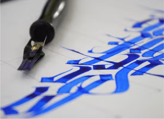
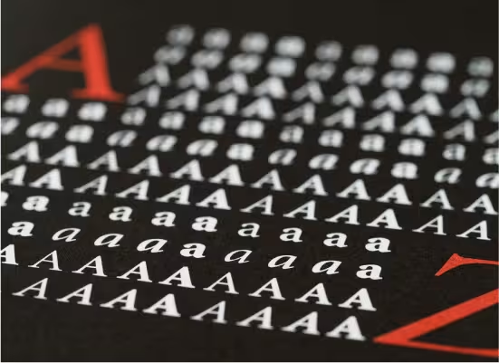
CREATIVE DESIGN / Typography
Typography for any brand / project is more than just selecting a pretty font; it is the structural backbone of design that dictates how a message is felt and understood. When done right, it guides the eye, establishes trust, and turns a chaotic layout into a cohesive brand story.
Though often used interchangeably, they represent two different layers of the creative process:
Typeface (The Creative Work): This is the specific design of the letters. Think of it as the "album." Examples include Helvetica, Times New Roman, or Futura. It represents the artistic style and personality.
Typography (The Craft): This is the actual arrangement and styling of those letters. It involves the "performance"—adjusting the size, line spacing (leading), letter spacing (kerning), and hierarchy to ensure the text is functional and aesthetic.
To create a brand guideline, it requires a strategic approach to font pairing. The goal is to visually harmonize through contrast.
Advisable not to use more than three fonts. Ideally, stick to two: one for headings and one for body text. Combining a sturdy Serif font with a clean Sans-Serif creates magic. Helps create contrast preventing the design from looking interesting and eye catchy. Using weight (Bold vs. Light) and scale (Large vs. Small) to guides the reader exactly where to look first and so on.
Mood Matching: Typefaces have the magic of representing feeling / words though ensuring the "voice" of the fonts matches the brand. Example: If a law firm uses a classic Serif for authority, on the contrary, a tech startup uses a geometric Sans-Serif for a modern feel.
There are multiple ways we can bring synergy in the design. Allowing elements of an illustration or photograph to "interact" with the letters—perhaps a person in a photo overlaps a letter, or the text follows the curve of a graphic. Align text with the "grid" of your images. If a photo has a strong vertical line (like a building), align your text to that same axis to create a sense of intentional structure. Use the empty areas of an illustration to house the text. If the designs are prevented from feeling cluttered it solves the purpose.
Sometimes, there is no need for even a single photo or icon. Typeface alone can be the primary visual driver. Imagine the word "Melt" where the bottom of the letters is dripping. The typography becomes the illustration or huge, oversized sans-serif fonts that take up 90% of the page. The sheer scale itself creates an impact without a photograph, even moving text that changes pace with music can convey emotion faster too.
In this world of short attention spans, typography also plays as the most efficient tool. By limiting typefaces, respecting hierarchy, and treating text as a visual element rather than an afterthought, designs aren't just seen—they’re experienced. Good typography is unforgettable.
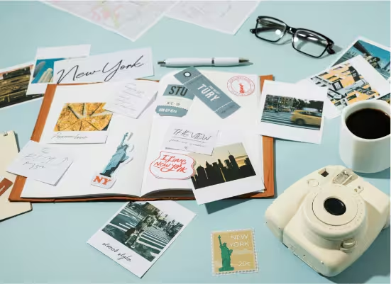
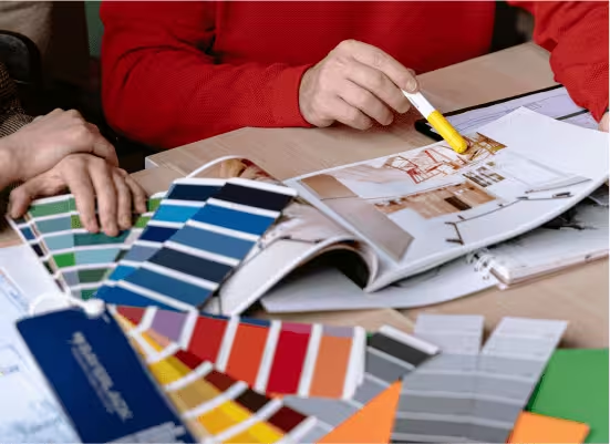
CREATIVE DESIGN / Mood Boarding
A mood board is a curated collection of images, textures, typography, color palettes, illustrations and more that serves as a stable, long-term visual direction for any creative project based on the specific brief. It bridges the gap between a vague idea and a concrete design direction.
1. Breakdown the brief: Based on the brief, start describing it and compartmentalize them into multiple keywords. (e.g., "Segment," "mood," "tone" etc).
2. Gather Assets: Start collecting photos, cues, digital clipart, fabric textures, even UI elements and whatever relevant to the provided brief.
3. Choose appropriate features: Narrow down the available options to best align with the brands brief. Identify 3–5 primary colors to establish the desired emotional tone. Likewise, refine other collected elements until the most suitable cues are determined.
A mood board is more than a collage of elements; it’s a toolkit. You can pull:
Lighting Cues: Does the board feel moody and shadowed or bright and airy?
Composition: Are the visuals minimalist and spacious or cluttered?
Typography: Match the "weight" of the visuals with fonts (e.g., does sharp, angular images pair well with bold sans-serifs and so on) do the similar process with colors, and other collection too.
Consistency: Every design choice is backed by the established theme.
Speed: Decisions on colors/fonts are already made, reducing friction.
Communication: Clients/teams can "see" the vision before work begins.
Inconsistency: Designs often drift or feel "muddied" over time.
Analysis Paralysis: Spending hours second-guessing basic aesthetics.
Misalignment: Risking a full redo because the vision wasn't shared.
Branding: blue and gray gradients, glitch effects, and futuristic fonts create a Tech startup identity.
Event Planning for a destination wedding: Pastel florals, lace textures, and vintage calligraphy define a Classic Romantic wedding.
Interior Design for In-Store Branding: A display board showcasing raw wood, linen fabric samples, and appropriate patterns or marble accents on the wall contributes to an eco-friendly atmosphere.
Think of a mood board as your brand’s blueprint. By investing time in visual research upfront, you eliminate guesswork and ensure the final output is cohesive, intentional, and emotionally resonant.
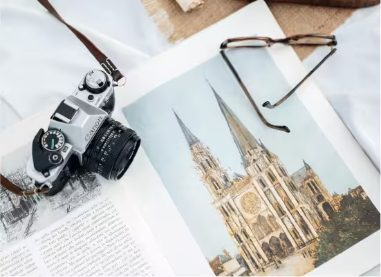
CREATIVE DESIGN / Design Inspirations
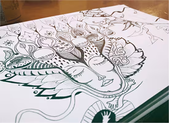
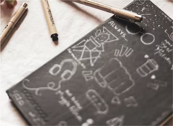
In a designer’s life, inspiration shouldn’t be a bolt of lightning that strikes occasionally; it should be a constant stream that should tapped into. A handy notebook for a designer should become physical extension of his/her brain. A designer, instead of staring at a blank canvas, can capture raw sparks in real-time, and build a personal repository of "constant creative flow" to draw from.
The world around us: Inspirations are everywhere. The textures on an old brick wall, the way shadows fall at 4:00 PM, or the organic curves of a leaf. Nature is the ultimate master of color palettes and layouts and more.
Get inspired from the everyday utility: Ever noticed the typography on a vintage fire faucet? The grid systems of a grocery store shelf, or the UI of an ATM. Everyday utility often holds the best lessons in functional design.
Art & Media: You cannot just look at graphic design alone. Pull from cinematography (framing), fashion (texture layering), or music (rhythm and pace).
Notice the minute details: Sometimes a random phrase from a podcast or a lyric can spark a visual metaphor. Write down the feeling the word gives you.
Find design everywhere: Beyond specific sites online, look at architectural archives, old map collections, or even microscopic photography.
1. Review the notebook often: Make time to flip through your notes. You’ll see patterns—maybe you’ve been subconsciously obsessed with neon greens or raw and rough layouts.
2. Concept creation exercise: To sharpen your creative instincts or hunger, as an exercise, pick two unrelated notes (e.g., "vintage menu card" and "circuit board patterns") and see how they can merge into a unique visual language. Probably the pattern behind in the circuit board can become the background and the typo can become the key design element for the new design.
3. Ask yourself questions: Whenever you are looking at an idea you jotted down, ask "Why did this idea felt workable?" Is it the contrast? The white space? Then applying that specific logic to your current brief works wonders.
4. Mood Boarding: Whenever you’re stuck, create a physical mood board. Seeing your own handwritten thoughts alongside digital assets will trigger ideas to create a more authentic, "workable" design.

In the end, the goal is not to copy what you see, but to build a visual vocabulary or an idea repository so deep that you never have to start from scratch. By staying curious and jotting down your ideas on the move, you transform into a designer who curates them.
CREATIVE DESIGN / Professional Creative Studio Partner
In a busy crowded marketplace, businesses often fail not due to poor products, but because of poor perception. A brand’s visual identity is its first and most critical handshake with a consumer. Template driven and widely available DIY design tools often produce generic results, making it difficult for brands to stand out.
Investing in a professional creative studio transforms your brand from a basic business into a market leader by blending strategy, psychological design, and operational consistency. A professional creative studio does more than make your business “look pretty”; it creates a deliberate system designed to connect with your ideal customer’s mindset and buying decisions.
Commands Premium Pricing
- Perceived Value Upgrades: Customers naturally associate high-end, polished design with premium product quality.
- Margin Expansion: Professional branding minimizes price resistance, allowing you to charge significantly more than competitors using generic templates.
Captures Market Trust
- The 3-7-27 Exposure Rule: Consumers require roughly 3 exposures to notice a brand, 7 to remember it, and 27 to trust it.
- Cohesive Touchpoints: A creative studio builds cross-platform visual consistency that accelerates this trust curve much faster than DIY branding.
Competitive Differentiation
- Bespoke Positioning: Studios research your specific industry landscape to build an original visual language that contrasts sharply against your competitors.
- Approaching Your Brand Concept: A unique design ensures your business stands out as a distinct choice rather than an interchangeable service.
Drives Conversion Rates
- Intentional UX Design: Good design maps out customer behavior, seamlessly guiding website visitors toward the checkout button or contact form.
- Functional Aesthetics: Visual assets are structured around data-driven performance metrics to ensure your marketing collateral generates revenue.

Strategy Over Decoration: Professional designers focus on your business goals, target demography, and long-term scaling before drawing a single line.
Multidisciplinary Cognitive Ability: You gain immediate access to a unified team of art directors, copywriters, motion designers, and brand strategists under one roof.
Visual Systems: Studios deliver comprehensive brand guidelines specifying precise typography, color palettes, and structural layouts to keep future marketing aligned.
Impactful Production Standards: Assets are built correctly from the start, avoiding pixelation, formatting errors, or rendering issues across print and digital media.
Eliminates Costly Trial-and-Error: Shifting back and forth between cheap freelancer platforms or wrestling with generic AI tools wastes precious time and introduces severe legal and trademark risks.
Provides an Objective Perspective: Internal teams often develop tunnel vision; an external studio brings a fresh eye to unpack hidden angles and reposition your business for greater value.
Guarantees Extreme Resource Efficiency: Outsourcing your creative engineering lets your core team focus purely on scaling operations, fulfillment, and sales without getting bogged down by content creation bottlenecks.


A professional creative studio does not treat design as an expense; they treat it as an appreciating business asset. By combining deep market strategy with precise execution, a studio builds an original visual universe that captures instant trust, repels price resistance, and leaves competitors scrambling to catch up. In an era where consumer attention is the rarest commodity, professional branding is no longer a luxury—it is a core requirement to endure, scale, and surge your business.


This creative design blog serves as a platform to share insights, trends, and inspiration from the world of visual communication. Through engaging articles, we discuss innovative techniques, and highlight the importance of aesthetics and design strategy in effective branding.